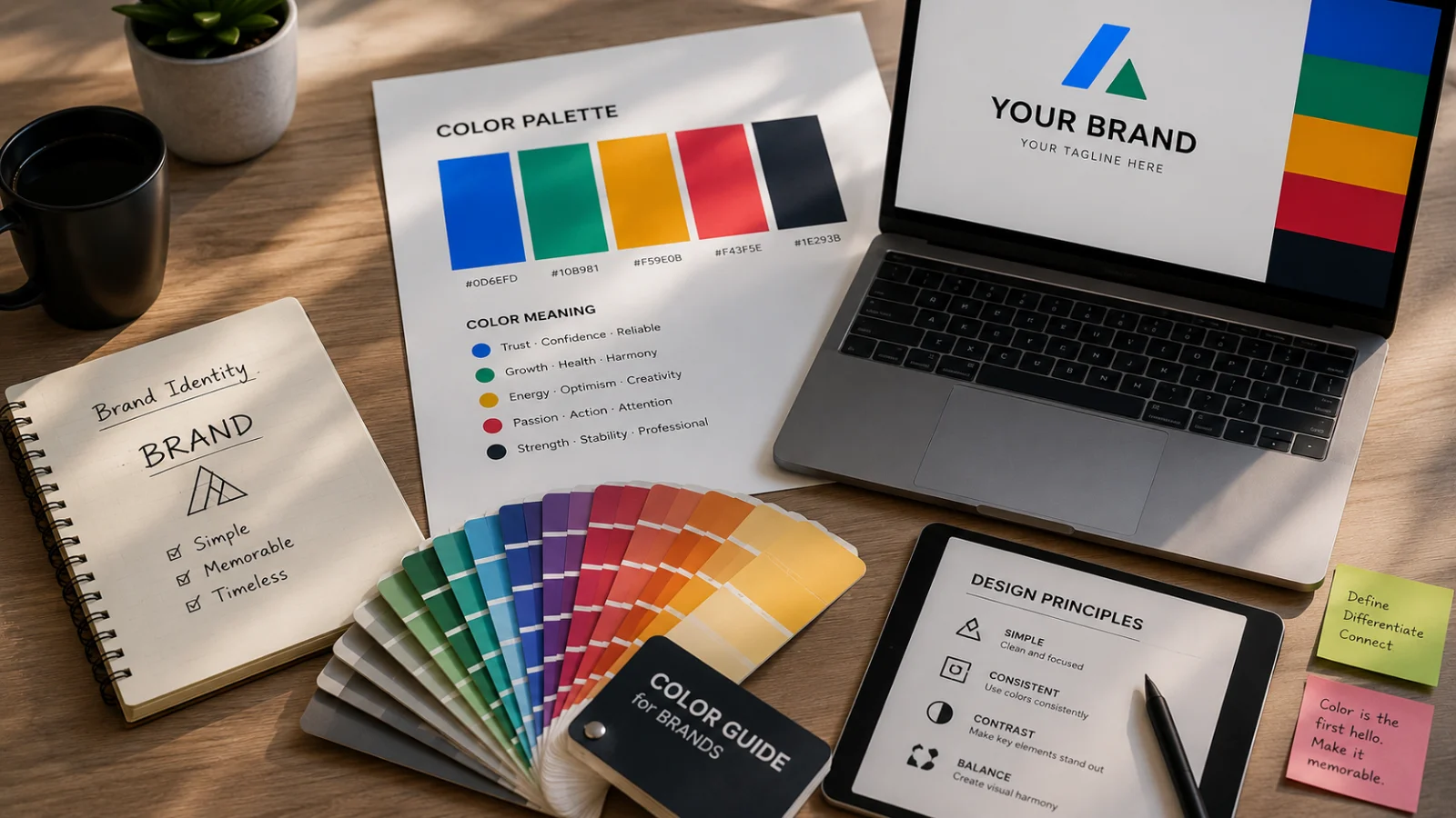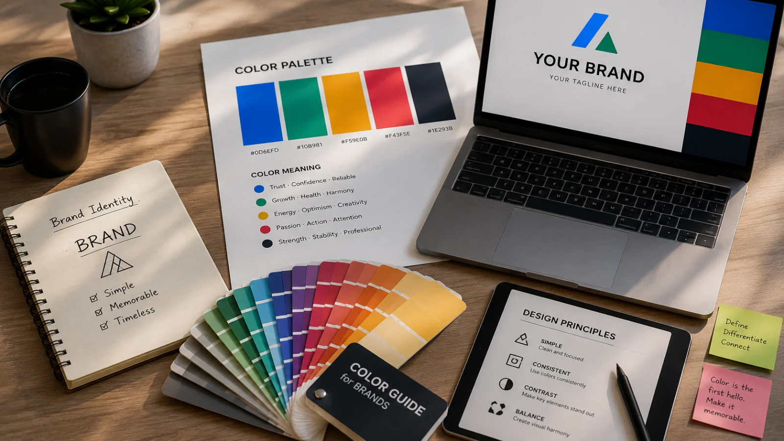
A founder chooses blue because “blue communicates trust.”
The problem appears when every major competitor in the category has made exactly the same decision.
The psychology may be reasonable, but the brand becomes harder to distinguish and remember.
The best brand color is not simply the one with the right psychological meaning. It also needs to be distinctive, usable, accessible and appropriate for the market.
Start with a competitor color audit
Before selecting a palette, review the primary and secondary colors used by the businesses your audience already knows.
| What to review | Why it matters |
|---|---|
| Dominant category colors | Shows which colors have become visually predictable within the market |
| Common combinations | Helps avoid reproducing a competitor's overall visual impression |
| Audience expectations | Some categories rely on familiar signals that should not be ignored completely |
| White-space opportunities | Reveals credible ways to stand apart without becoming visually inappropriate |
Keep the palette controlled
A practical brand system does not need ten prominent colors.
Most startups can work effectively with one primary color, one or two secondary colors, neutral backgrounds and functional colors for success, warning and error states.
A controlled palette is easier to remember and much easier for teams to apply consistently.
Test accessibility before approval
A color combination can look excellent on a mood board and still perform poorly on a website.
Test the palette in realistic situations such as:
Buttons
Body text
Headings
Forms
Light and dark backgrounds
Mobile interfaces
Readability should never be sacrificed purely for visual style.
A brand color that users cannot read comfortably is not functioning successfully as a brand color.
Test colors in real applications
Do not approve a palette as isolated swatches.
Apply it to a homepage, social post, presentation, advertisement, business card or packaging mockup.
Some combinations feel elegant at small scale but become visually overwhelming when used across complete layouts.
Use color psychology correctly
Color psychology can be useful, but it should support the decision rather than control it completely.
Understand what the market already looks like.
Clarify what the brand should feel like before choosing specific colors.
Find choices that fit the personality without disappearing into the category.
Verify contrast and readability across digital applications.
Evaluate the palette in the situations customers will actually see.
Check whether colors carry unintended meanings in important markets.
Frequently asked questions
How many brand colors should a startup have?
One primary color, one or two secondary colors and a neutral system are enough for many early-stage brands.
Should we avoid a color if competitors already use it?
Not automatically. The decision depends on how dominant that color is and whether your overall visual system can still remain distinctive.
Can brand colors change later?
Yes, but changing an established palette can affect recognition and require updates across websites, packaging, templates and advertising.
Monk Media One develops brand color systems by combining market differentiation, accessibility, customer context and real-world design applications.
Choose colors that work beyond the mood board.
Build a palette that is distinctive, accessible and usable across every important brand touchpoint.
Explore Brand Identity